Branding DeveloperWeek NY at TWA - By Accident
How a photograph created by accident became the visual foundation for DeveloperWeek New York at the legendary TWA Hotel.
DAte
Category
Branding
Reading Time
3 Min

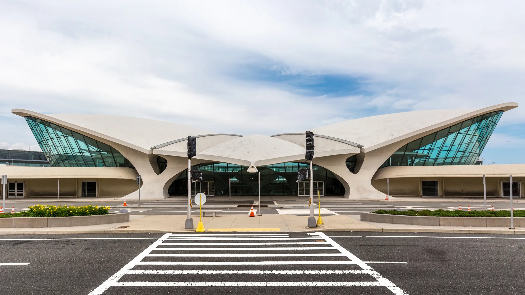
For DeveloperWeek New York 2026, 24Creative was tasked with bringing the event’s visual identity into one of New York’s most recognizable spaces: TWA Hotel.
What we didn’t know at the beginning was that part of the visual identity had already been created — completely by accident, two months earlier.
Two months before I knew I would be working on DeveloperWeek New York, I was experimenting with a blue LED light in my room.
The light hit the wall in an interesting way, creating a strange reflection. I took a photo of it.
I wasn’t working on a project. I didn’t have a brief. I didn’t know what I was going to use it for.
I just liked what I saw.
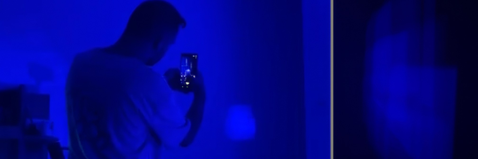
The photo stayed on my phone.
Then, two months later, the DeveloperWeek New York project came around.
And suddenly, that photo made sense.
Two Brands. One Space.
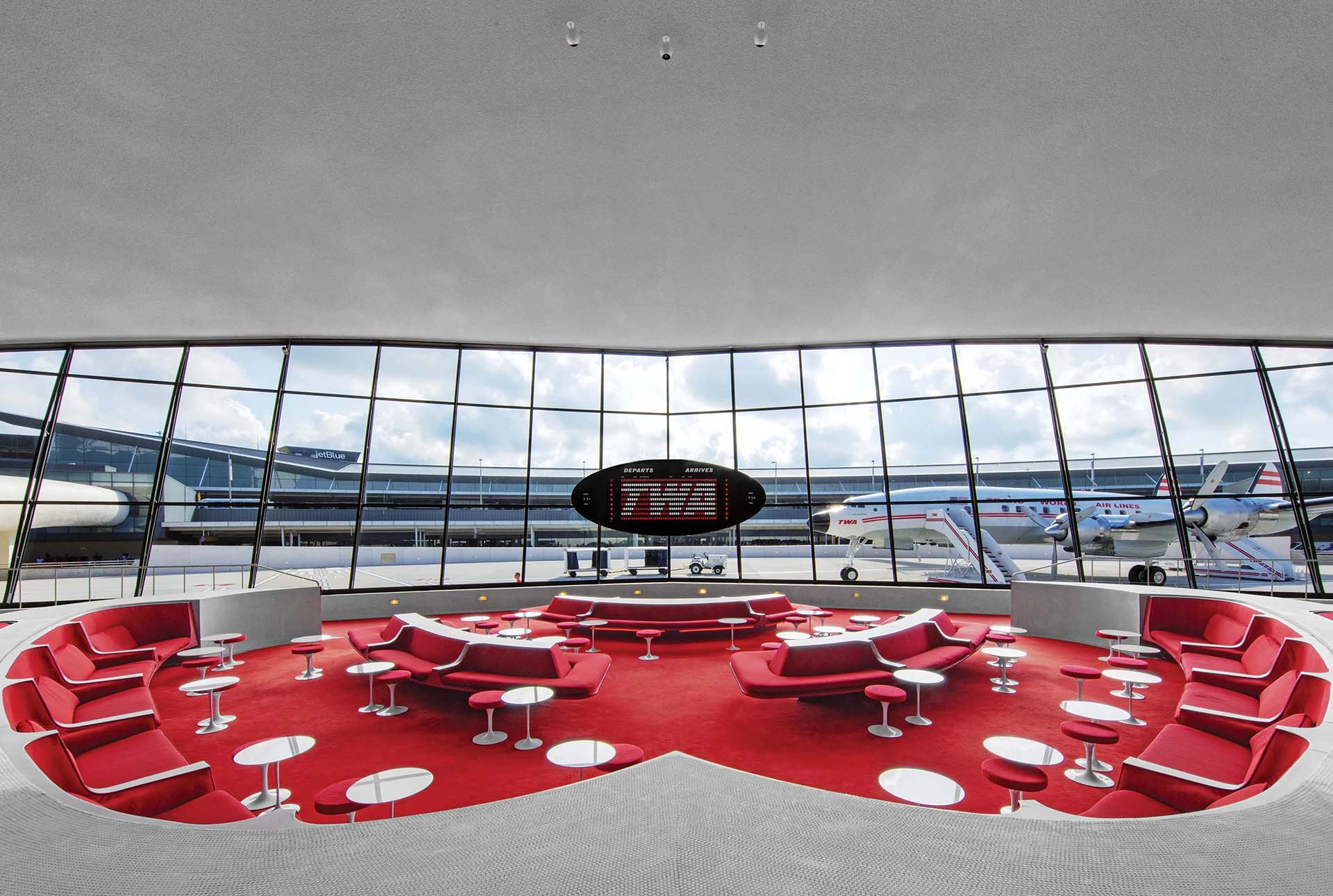
DeveloperWeek has a strong blue visual identity. TWA Hotel, on the other hand, has an incredibly distinctive visual language of its own — from its bold red elements to its sculptural architecture.
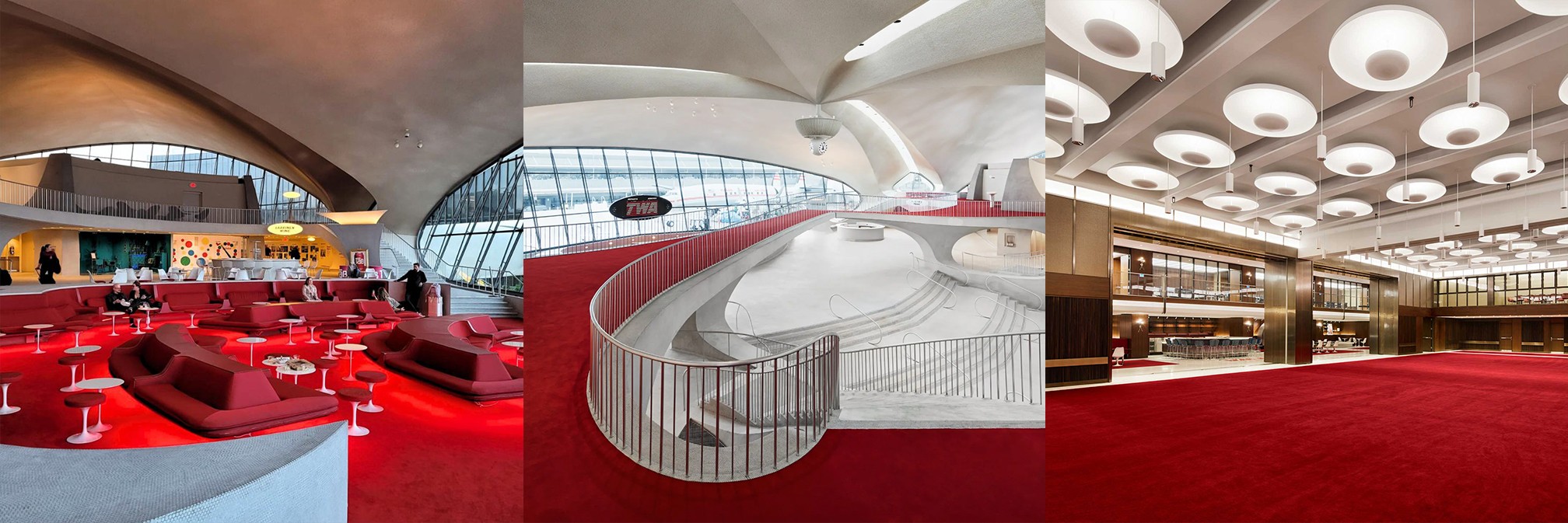
The challenge was finding a way for DeveloperWeek to feel present and recognizable without fighting against the character of the venue.
Instead of creating a completely new graphic language from scratch, I went back to that photo.
I upscaled the image and started experimenting with its shapes, color and composition. The original reflection became a flexible visual element that could be adapted across different formats and applications.
The goal wasn't simply to use the photograph as a background. It needed to become part of a system.
From One Image to an Event Identity
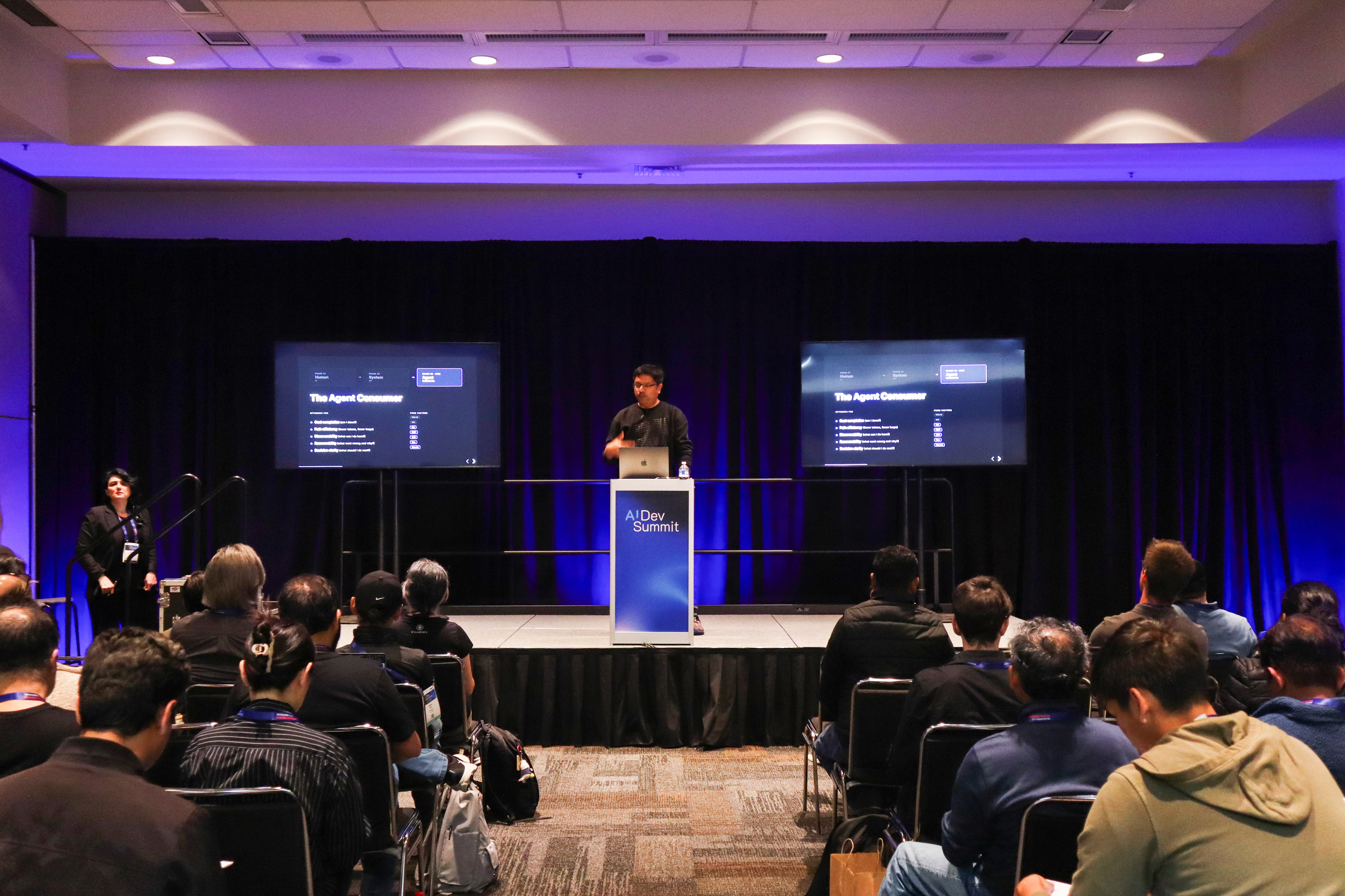
Once the visual direction was established, we started applying it across the DeveloperWeek experience.
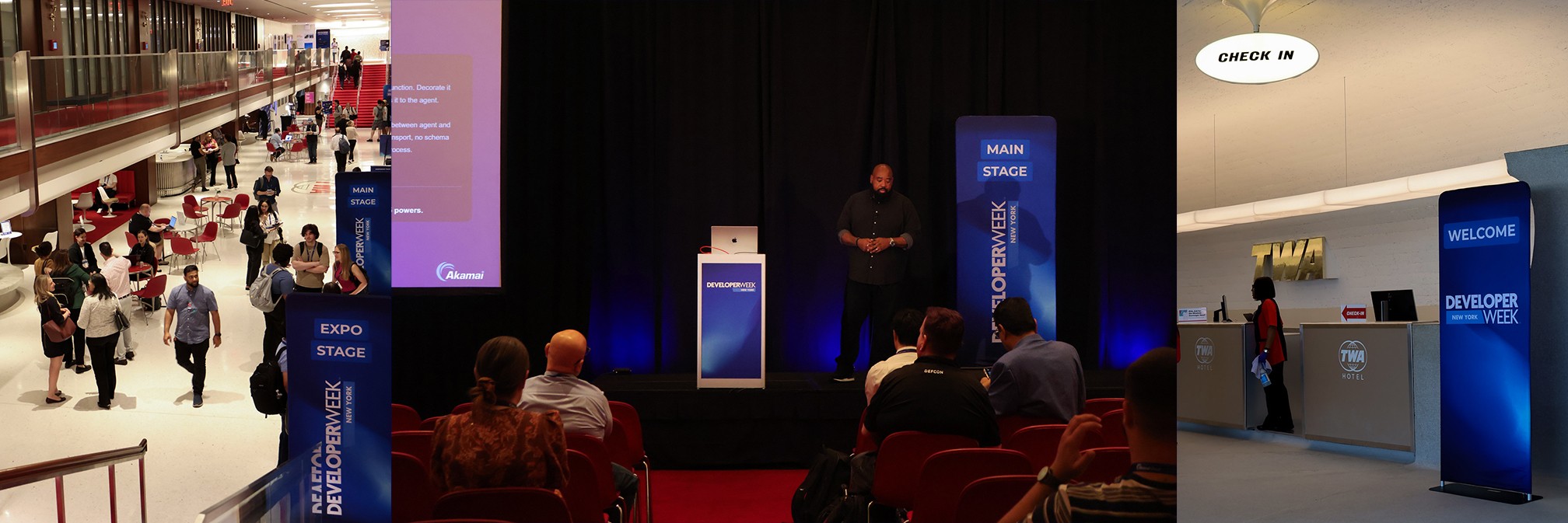
Environmental graphics, signage, digital screens, stage visuals and other event materials all needed to feel like parts of the same identity while working within the physical environment of TWA Hotel.
The blue DeveloperWeek NY identity became a visual contrast to the red surroundings of TWA — creating a relationship between the two rather than forcing one to overpower the other.
What started as a single photograph gradually became a complete visual language for the event.
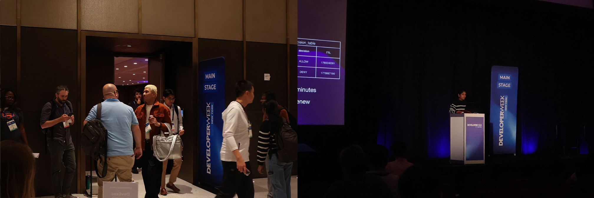
The graphics had to work alongside TWA’s architecture, signage, lighting and existing visual character. Instead of trying to hide the venue’s identity, we used it as part of the experience.
Observe
The image was never created with a project in mind. It came from simply paying attention to something that looked interesting.
That, to me, is one of the most valuable parts of creative work.
Ideas don't always start with a brief, a moodboard or a blank artboard. Sometimes they start by noticing something — a reflection on a wall, an unusual shadow, a combination of colors, or the way light moves through a space.
The important part is to notice it when it happens.
Two months later, that small observation became the foundation for an entire event identity.
Good design can start anywhere. You just have to be paying attention.
Author
Sava D.
Founder & Creative Lead @ 24Creative