We’re Branding the Legendary TWA Terminal at JFK
This June, we’re working on branding DeveloperWeek New York at the TWA Hotel - and honestly, it’s one of those projects that feels exciting and tricky at the same time.
DAte
Category
Branding
Reading Time
3 Min

This June, we’re working on branding DeveloperWeek New York at the TWA Hotel - and honestly, it’s one of those projects that feels exciting and tricky at the same time.
If you’ve ever seen the space, you already know why.
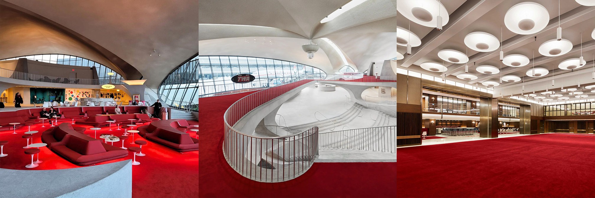
Originally designed by Eero Saarinen, the whole place has a very specific identity. The red, the curves, the lighting - everything is already so defined that it almost feels like the space is “branded” on its own.
Which is great… until you have to put another brand inside it.
So here’s the situation...
DeveloperWeek NY has a strong blue identity. The TWA Hotel is… very red. And not just “a bit red” - it’s the kind of red that dominates everything around it. So the question we’re working through right now is pretty simple: do we try to blend in, or do we intentionally stand out?
Right now, we’re leaning toward contrast. In spaces like this, trying to “fit in” usually just makes everything disappear. The venue is too strong. So instead of fighting that, we’re thinking: what if the blue actually works because of the red? What if that tension is the whole point? That’s where it starts to feel interesting - not just visually, but from a branding perspective too.
This is the part we didn’t expect to think about this much. DeveloperWeek is a very forward-looking, tech-driven conference, and the New York edition actually had the same blue branding five years ago when it was last held. The TWA Hotel represents something completely different - a very iconic, almost nostalgic vision of the future from the past.
Putting those two together naturally creates a story. And whether we like it or not, the branding becomes part of that story. So now we’re not just asking “How should this look?” We’re asking “What does it mean for this event to exist here?”
Right now, we’re deep in exploration mode - how far we push contrast vs. control it, where we let the venue win, and where the brand needs to take over.
Because the reality is - in a space like this, you don’t get neutral results. It either works really well… or it just feels off. We’ll share more once things start coming together, but this is one of those projects where the process itself is just as interesting as the final result.
Author
Sava D.
Founder & Creative Lead @ 24Creative
